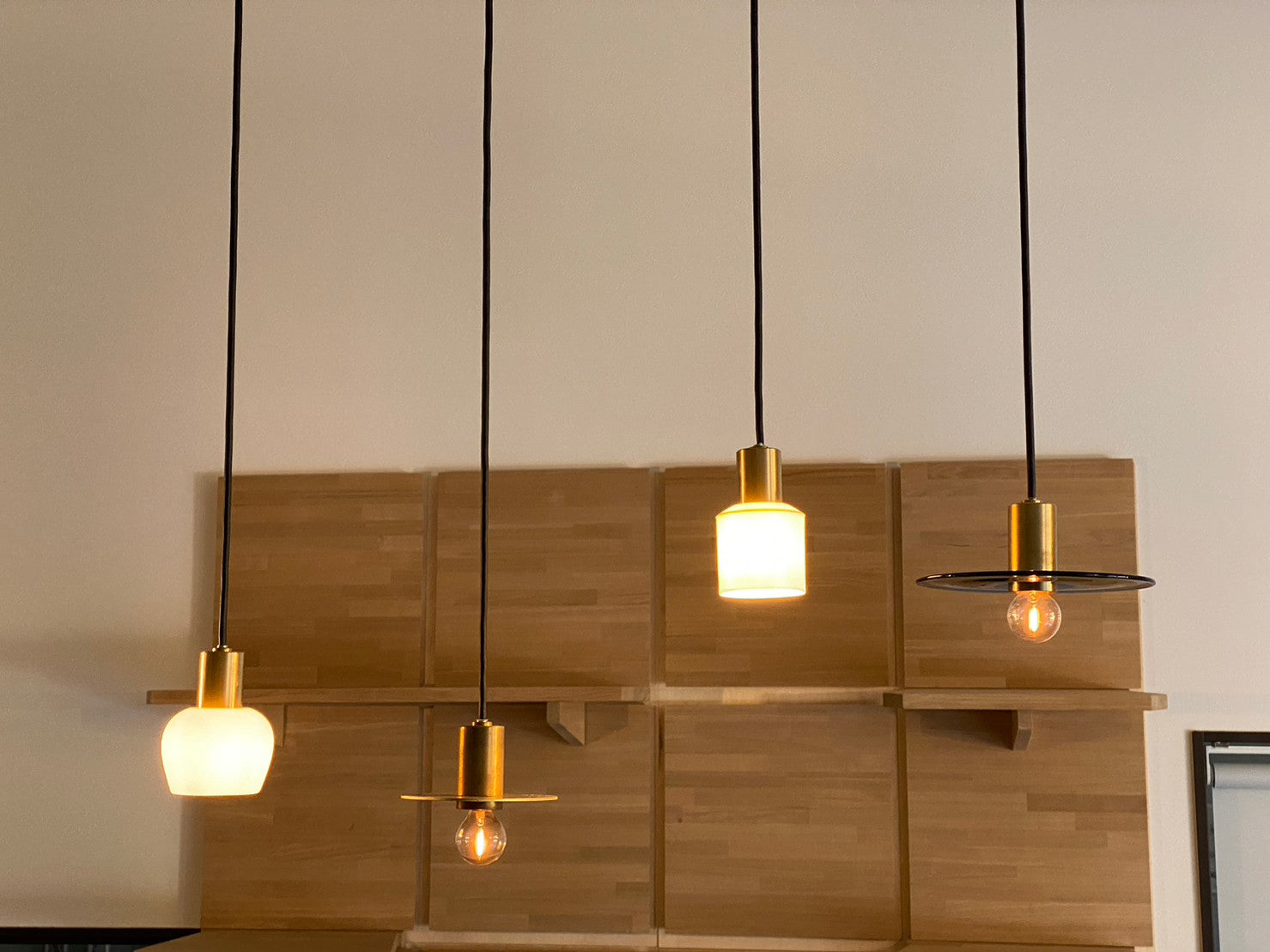

8 Points to Help You Choose the Right Light
This time, we’ll introduce “light color” and “color temperature,” which are important when choosing lighting.
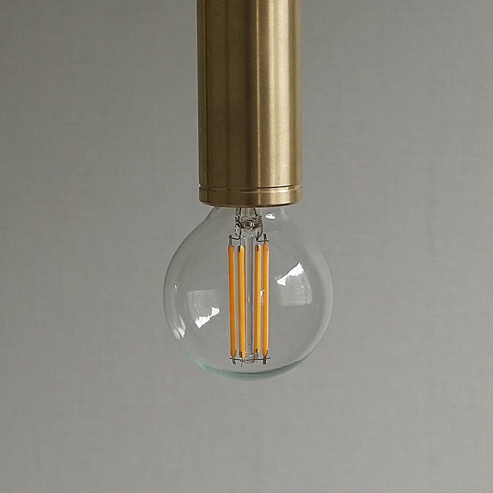
Even with the same light fixture, simply changing the color of the bulb can dramatically alter the impression of the space.
Warm light makes the entire space look soft and creates a calm atmosphere.
Whiter light creates a clean, bright, and distinct impression.
“Color temperature” is a useful guide when choosing this light color.
Knowing about color temperature makes it easier to choose a bulb that suits the space, rather than relying solely on a vague personal preference.

What Is Color Temperature?
Color temperature is a numerical value that represents the hue of light.
The unit is “K,” which stands for Kelvin.
The lower the number, the warmer and more orange the light becomes.
The higher the number, the whiter the light, and at even higher numbers, it takes on a bluish hue.
For example, warm light, known as incandescent color, is generally around 2700K–3000K.
Warm white is around 3500K.
Daylight white is around 5000K.
Daylight color is generally 6000K or higher.
Even bulbs with the same brightness can significantly change how a space looks and feels simply by changing their color temperature.
Incandescent Color Makes a Space Look Soft
Incandescent color is a warm light around 2700K–3000K.
Its slightly yellowish light gives a space a calm and reassuring feel.
It is ideal for places where you want to relax, such as the living room, dining room, or bedroom.
Time to eat.
Time to relax on the sofa.
Time to dim the lights and unwind before bed.
In these situations, a warm light like incandescent color can feel more comfortable than a bright white light.
It also pairs well with materials such as brass, wood, and white porcelain, naturally bringing out their warmth.
At CTSH LIGHT., we recommend incandescent color as a light that beautifully enhances the character of lighting.
Warm White Is a Balance of Warmth and Visibility
Warm white is around 3500K.
It is neither as strongly orange as incandescent color nor as white as daylight white, falling right in between.
If you want a calm atmosphere but also value a certain level of visibility.
Warm white may be the right choice for such spaces.
For example, in the kitchen, bathroom, or part of a workspace.
It is ideal for places where you want to maintain functionality without making the space look too cold.
If you want to create a warm atmosphere throughout your home but are also concerned about visibility when working with your hands.
In that case, warm white is another option.

Daylight White Creates a Clean, Bright Look
Daylight white is a whitish light around 5000K.
It makes a space look clean and bright, and makes it easier to see the colors of objects and fine details.
Daylight white can be useful in places such as the kitchen, bathroom, workspace, or where you get ready.
However, in places where you want to relax, such as the living room or bedroom, it can feel a bit bright and create a more alert atmosphere.
Visibility for working.
Calmness for relaxing.
As such, it is important to consider color temperature for each space.

The Right Color Temperature Varies by Space
We recommend considering color temperature for each room.
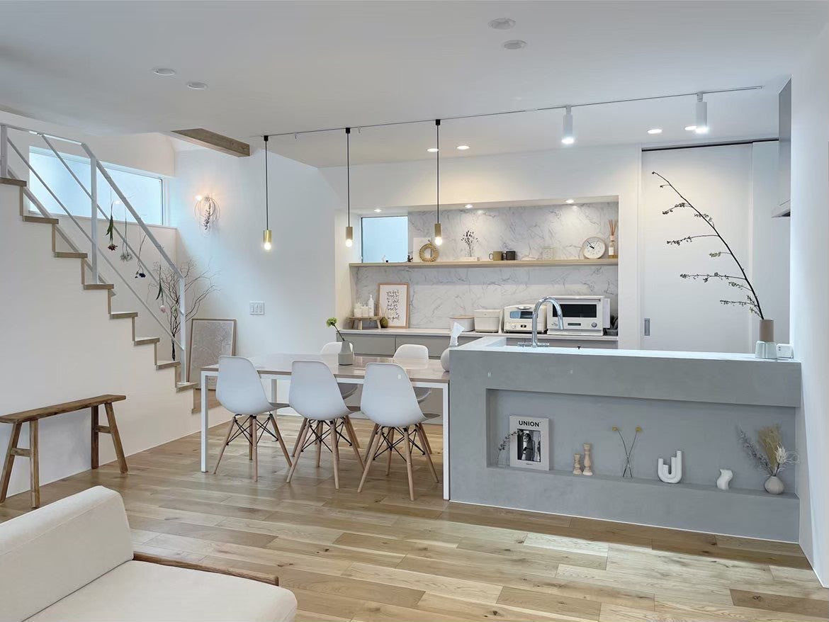
In the living room, use incandescent color around 2700K–3000K to create a relaxing atmosphere.
In the dining room, use incandescent color to make food look delicious and softly envelop the table.
In the bedroom, use a lower color temperature that will not disrupt your time before sleep.
In the kitchen, consider warm white or daylight white to prioritize visibility when working with your hands.
In the bathroom, choose a light that looks natural and makes it easier to get ready.
As such, the right light varies slightly depending on the space, even within the same home.
When choosing lighting, considering not only the shape and material of the fixture but also what you do in that space will make it easier to choose the right light for your lifestyle.
Color Temperature Also Changes How Materials Look
Color temperature also affects how the lighting fixture itself looks.
Brass takes on a deeper, softer appearance when illuminated by warm light like incandescent color.
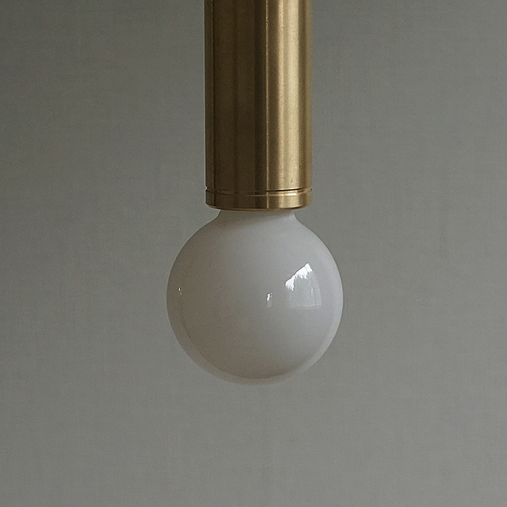
White porcelain catches the light and gently spreads it throughout the space.
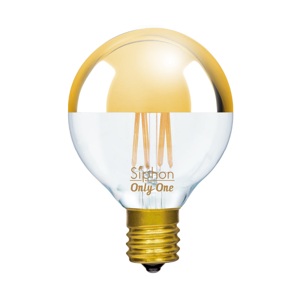
Chrome reflects the surrounding light, creating a clean, crisp reflection.
Black metal appears to have more defined contours due to the contrast with the light.
Even with the same light fixture, the impression of the material changes depending on whether it is lit at 2700K or 5000K.
Not only the brightness, but also how the material looks.
How it blends with the colors of the space.
How it harmonizes with the furniture, walls, and floors.
Thinking about it this way makes choosing lighting even more enjoyable.
First, Check How the Included LED Bulb Works with the Space
At CTSH LIGHT., an LED bulb is included with your purchase.
First, check how the included bulb looks when lit in your actual space.
The impression you get from a photo may differ slightly from how it looks when lit in your home.
The color of the walls, flooring material, ceiling height, furniture materials, and natural light coming through the windows.
These elements can change how a bulb with the same color temperature looks.
First, check how the included light works with the space, then consider changing the bulb to suit your preferences.
If you want a slightly calmer atmosphere.
If you want to add a little brightness.
If you want a light that makes working easier.
If you want to make the evening look even softer.
By changing the bulb in this way, you can enjoy lighting even more.
Color Temperature Sets the Mood
Lighting is not just for brightening a space.
The crisp brightness you want in the morning.
The calm light from evening to night.
The soft light that envelops mealtime.
The subdued light that helps you unwind before bed.
Simply changing the color temperature can slightly change how you spend your time in that space.
Just making the light a little warmer can make the space look softer.
Just making the light whiter can make working easier.
That small difference can make every day more comfortable.
How CTSH LIGHT. Recommends Choosing a Light Color
At CTSH LIGHT., we recommend warm incandescent color.
The shadows of metal.
The soft luster of brass.
The gentle brightness transmitted through white porcelain.
The lingering light spreading across the walls and ceiling.
To enjoy these expressions of material and light, a calm, warm light around 2700K–3000K is a great choice.
Of course, warm white or daylight white may be a better fit depending on the space.
The important thing is to balance functionality and atmosphere.
Visibility for working.
Softness for relaxing.
Light that makes materials look beautiful in spaces you want to enhance.
Just as you consider the shape and material of the fixture, take a look at the color temperature as well.
That alone can dramatically change the quality of the space.
Key Points!
Color temperature:
A numerical value that represents the hue of light, measured in K (Kelvin). The lower the number, the warmer the light; the higher the number, the whiter the light.
Incandescent color guide:
Around 2700K–3000K. Recommended for places where you want to relax, such as the living room, dining room, and bedroom.
Warm white and daylight white guide:
Warm white is around 3500K, and daylight white is around 5000K. Ideal for places where visibility is important, such as the kitchen, bathroom, and workspace.
Enjoying CTSH LIGHT.:
By changing the color temperature, the same light fixture can change how materials look and alter the impression of the space. First, check the atmosphere with the included LED bulb, then enjoy choosing a light color that suits your preferences.
CTSH Recommendations
At CTSH, we include and sell incandescent-color LED bulbs because they pair well with brass materials.
For workspaces, daylight white is recommended because it makes contours look sharper.
Depending on how you use the light, please purchase a daylight white bulb.